This project for a German airport parking platform demonstrates your skill in balancing a dual-sided marketplace with high information density, ensuring a seamless experience for both travelers and parking vendors.
Travel
Logistics
Duration :
14 Days
Platform :
WIX
Country :
Germany

Brief Context
The client required a comprehensive marketplace to connect travelers with secure parking near major German airports.
The platform serves two primary user groups: travelers looking to book safe, long-term parking while away on flights, and parking lot owners looking to list and manage their available inventory.
Built entirely on the Wix CMS, the goal was to provide a transparent, secure, and user-friendly portal that manages everything from discovery to booking and vendor onboarding.
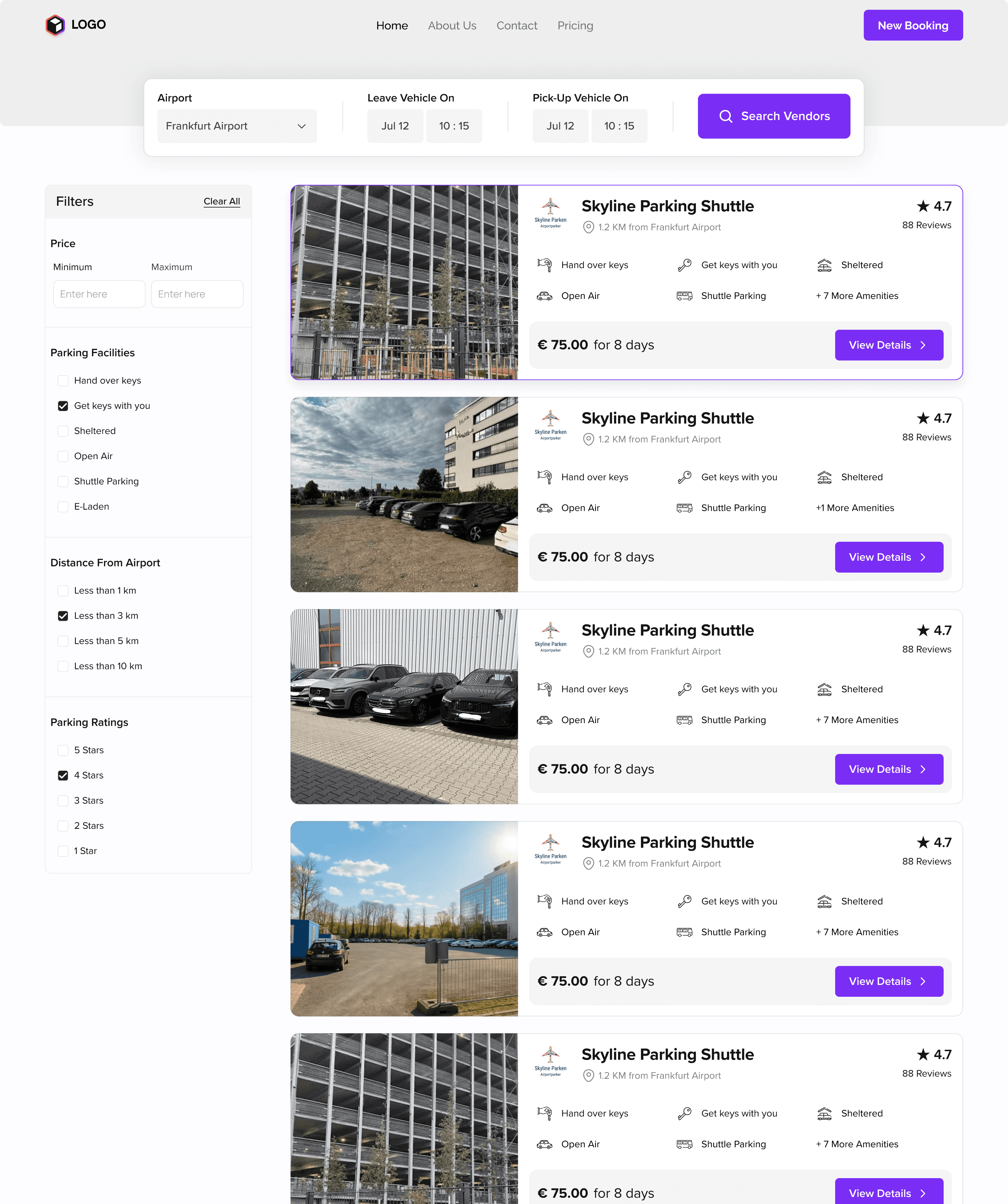
B2C Information Overload :
Traveler's needed to compare pricing, distances (e.g., "1.2 KM from Frankfurt Airport"), facilities (Shuttle, Valet, Sheltered), and customer reviews simultaneously.
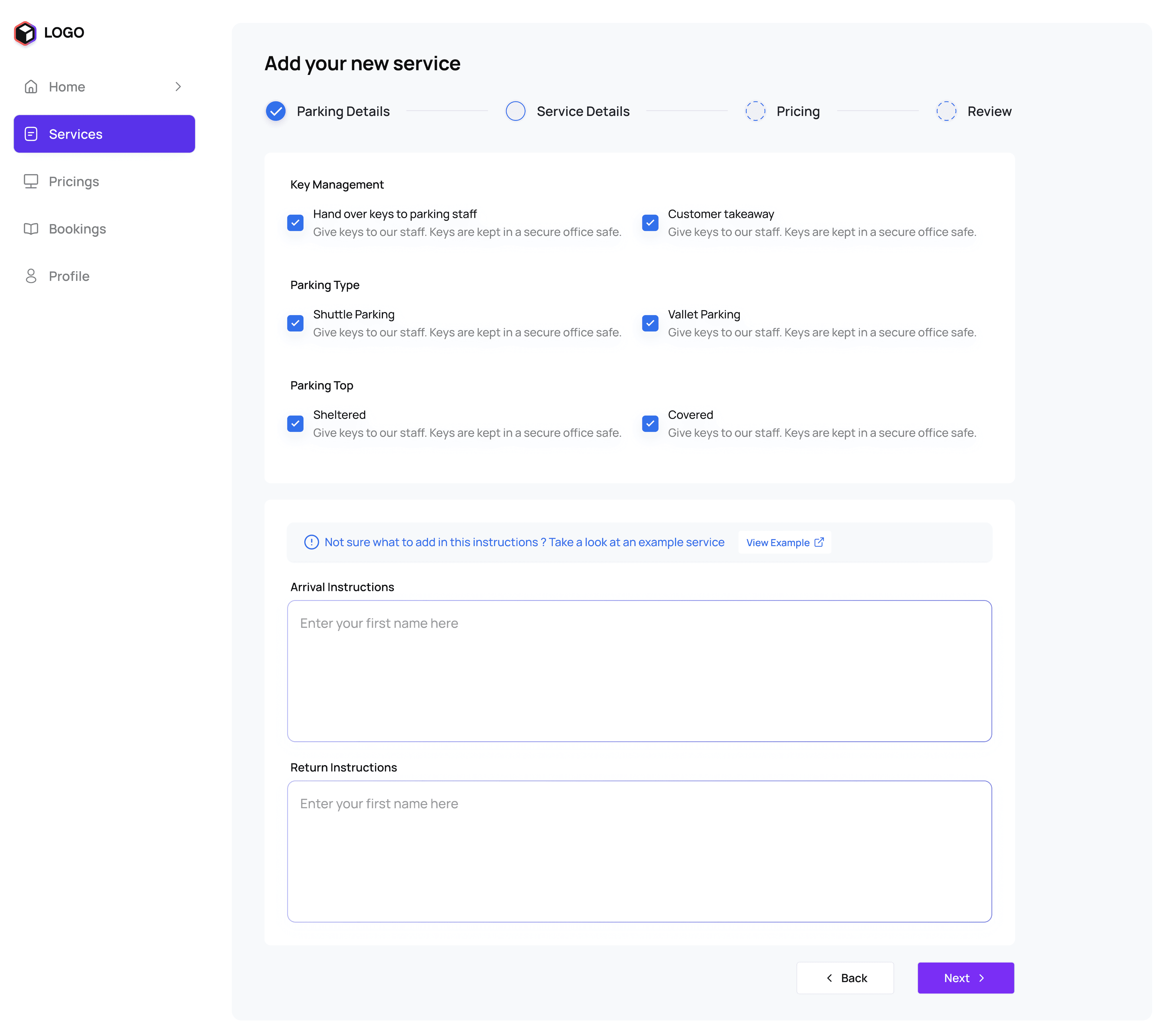
B2B Vendor Onboarding :
Designing a complex "Add Your Service" flow for parking owners that required business details, opening times, airport proximity, and high-quality photo uploads without being overwhelming.
Localized Trust & Security :
Since users are leaving their valuable assets (cars) behind, the design had to radiate security through features like "Random Test Bookings" and "Verified Providers".
CMS Scalability :
Leveraging Wix to handle a dynamic database of hundreds of parking slots while maintaining a high-performance, premium UI.
Design Approach
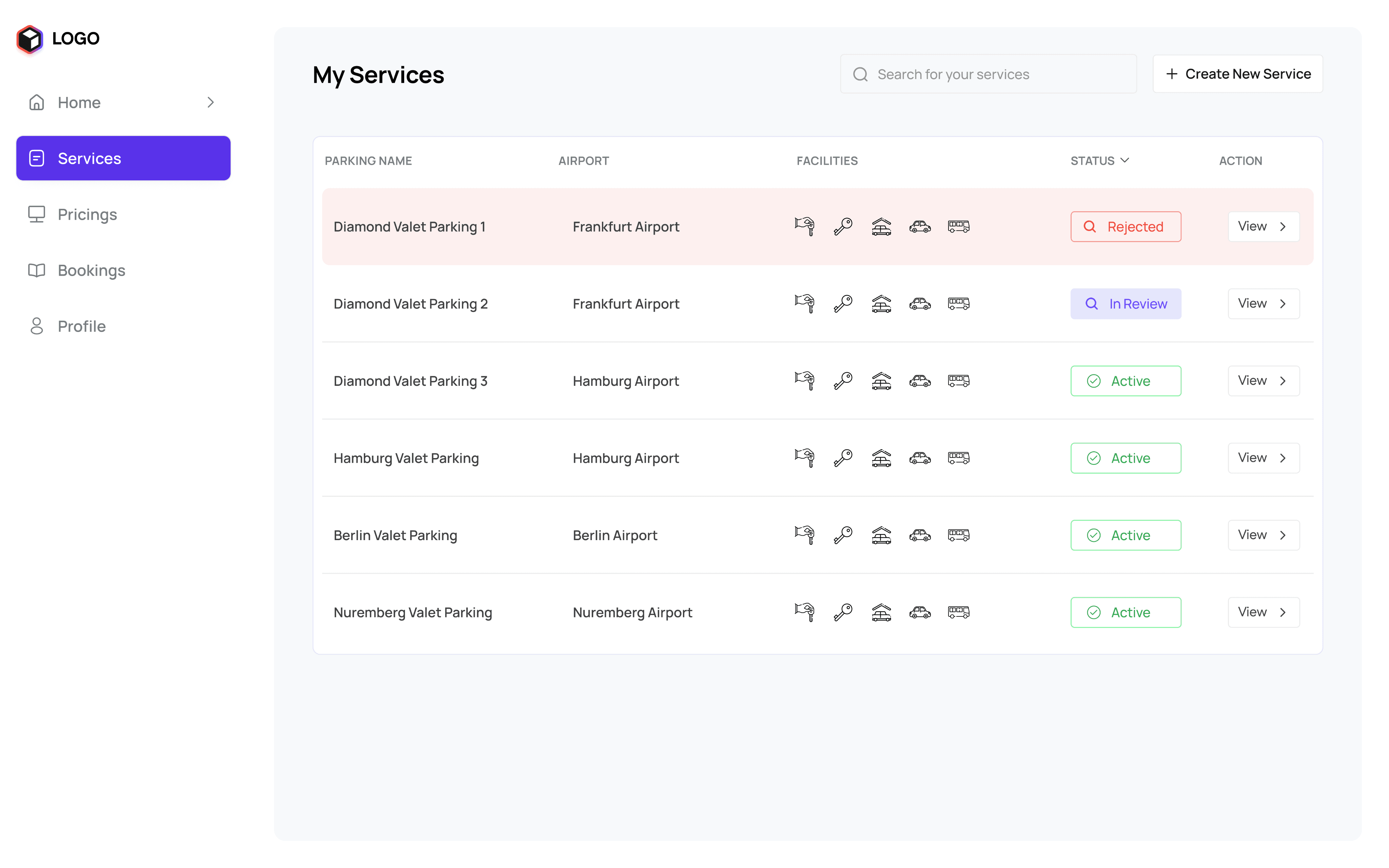
For the traveler experience, I focused on Information Hierarchy and Clarity. I utilized a card-based layout for the "My Services" dashboard to allow vendors to track the status of multiple listings (Active, In Review, Rejected) at a glance.
On the consumer side, I used a Sticky Booking Widget on the service pages, keeping the price and date selectors always visible as users scroll through detailed arrival instructions and parking photos.
To address vendor friction, I designed a Linear Stepper Form (Parking Details > Service Details > Pricing > Review) to break the onboarding process into manageable chunks.
I also implemented Visual Facility Icons (keys for valet, a roof for sheltered, a van for shuttle) to replace long text lists, allowing for faster comparisons on mobile and desktop.
Designs


Key Learnings
Simplifying Complex Marketplaces :
I learned that iconography and a strict grid system are essential when users need to compare highly similar service providers.
UX for High-Stake Decisions :
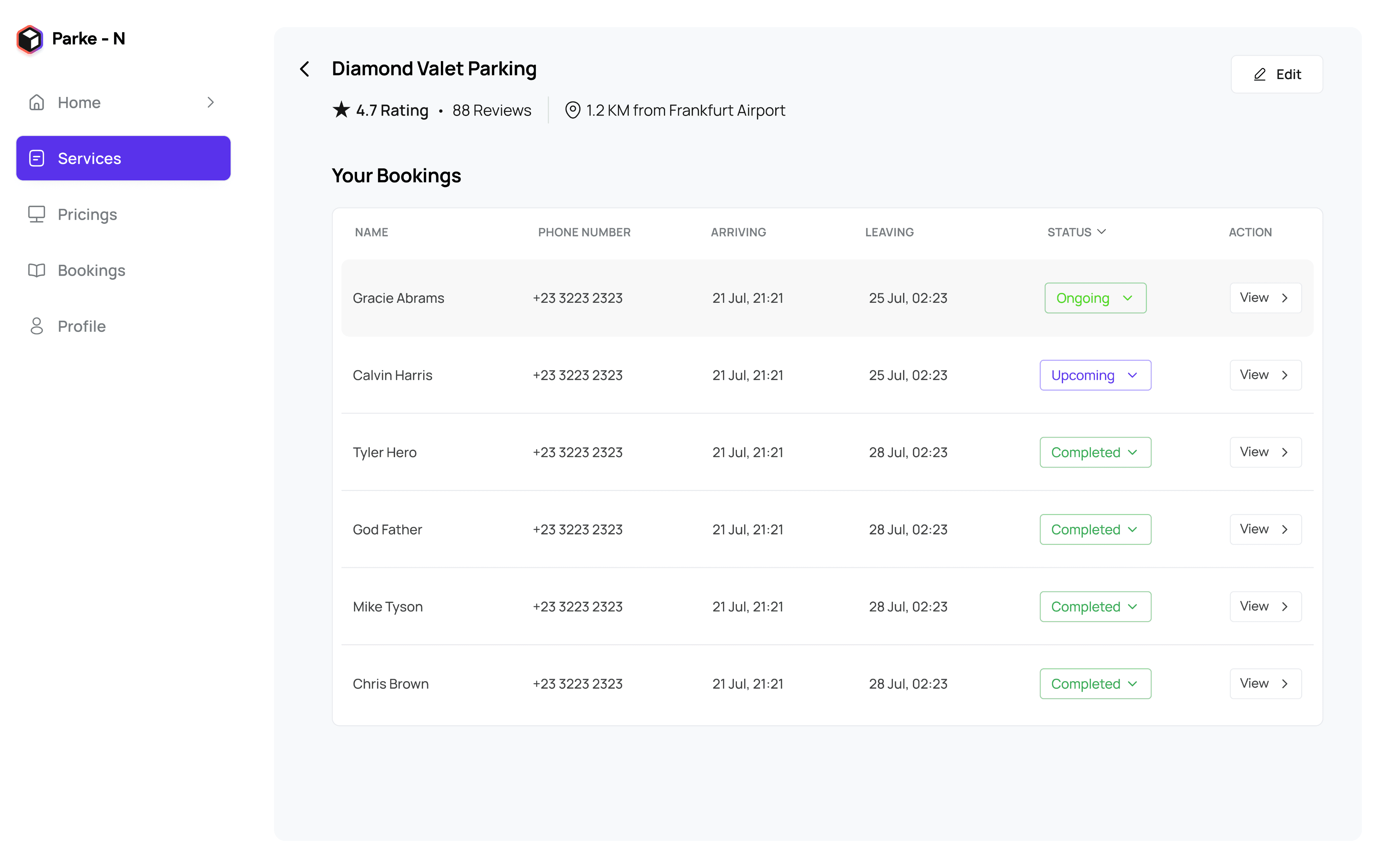
When a user's car is at stake, transparency in pricing and clear "Arrival/Return" instructions are the biggest drivers of conversion.
Efficient B2B Flows :
Breaking down a complex registration into a four-step stepper significantly reduces form abandonment for business owners.
Wix CMS Mastery :
Deepened my ability to build sophisticated, multi-user platforms using Wix while maintaining a bespoke, professional aesthetic.

