Dashboard & Company Search Redesign
This case study marks my transition into Product Design at PandaMatch, focusing on the core challenge of transforming a complex, data-heavy B2B tool into an intuitive lead-generation engine. By analyzing and focusing on high-impact UX improvements, I bridged the gap between advanced backend capabilities and user-centric frontend clarity.
Focus Area :
MVP Strategy, User Onboarding, and Error Prevention Logic
Core Objective :
To launch a high-speed "Leads Finder" MVP that validates market demand while minimizing user friction and financial anxiety.

Brief Context
When I joined PandaMatch, the platform’s identity was rooted in its "Lookalike Company Search" feature.
Users would input a domain or description to find similar companies and their associated professional contacts. However, the dashboard was functionally "crowded."
My mission was to clean the dashboard workspace to ensure sales professionals could focus on leads rather than fighting the interface.
This was a delicate balance: I needed to elevate the UX while respecting the existing technical architecture to ensure a fast, resource-efficient deployment.
Challenges
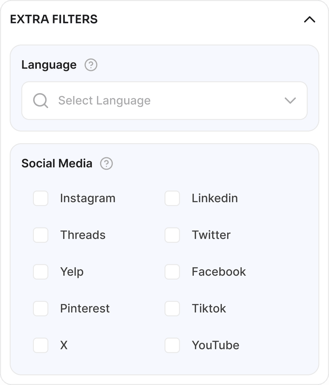
High-Density Filtration :
The sidebar contained a massive number of filters (Footprint score, Consensus, Match Precision, etc.) that lacked visual hierarchy, causing significant cognitive load.
Technical Resource Constraints :
We had a set team and timeline already focused on backend tasks; my designs had to be "dev-friendly" and implementable without drastic code refactoring.
Ambiguous Terminology :
Features like "Negative Search" relied on the user intuitively knowing it meant "Exclude," which led to frequent errors and support inquiries.
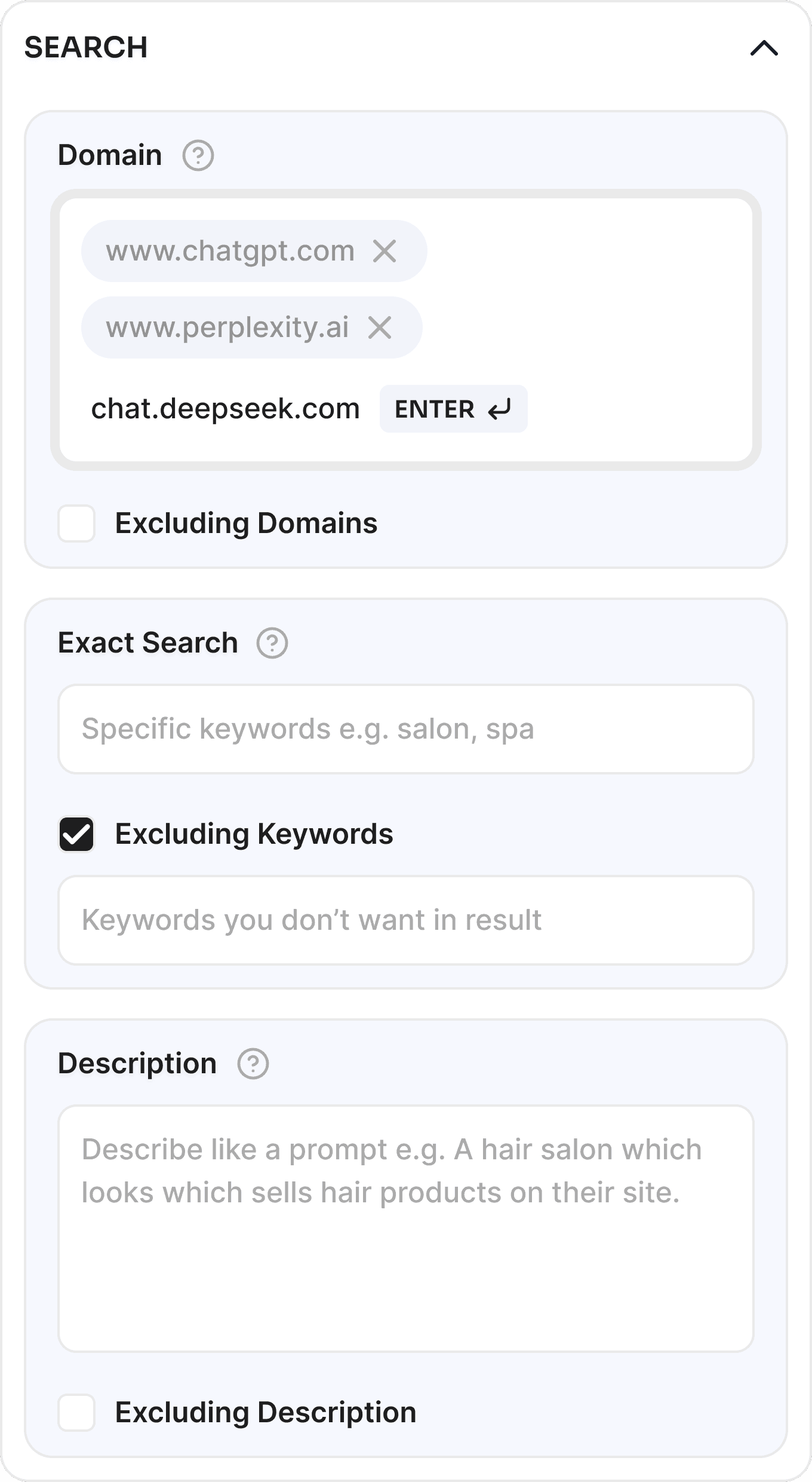
"Invisible" Input Triggers :
The domain search field required an "Enter" key press to commit a tag, but the UI provided no hint, leading users to believe the system was unresponsive.
Future Integration Planning :
I had to design a workspace that only focused on companies today but could seamlessly house the upcoming leads finder and community features tomorrow.
Design Approach
I began with testing, using the dashboard as a new user and watching other users also interviewing stakeholders to identify where sales teams were dropping off. My approach centered on Clarity and Categorization.
The Dual-Font Visual Identity :
To handle high information density, I moved away from a single-font approach.
Sora (Display): Used for titles and headers in All Caps to provide a bold, geometric "anchor" for the eyes.
Inter (Utility): Chosen for search results and tabular data because it remains highly readable even when space is tight, allowing for more data points per screen.
Grouping & Color Logic :
Instead of a single scrolling list of filters, I grouped parameters into thematic categories (e.g., Search Type, Match Precision, Social Scrapping). I used different color shades for these groups to create subconscious boundaries, helping users memorize the "location" of their favorite filters.
Progressive Disclosure for "Negative Filters" :
I completely overhauled the "Negative" search field. I renamed it "Exclude Keywords" and tucked it behind a checkbox. This reduced the visual clutter for standard users while making the feature explicit for advanced users.
Solutions
Interactive Input Hints: :
To fix the domain commit issue, I added a dynamic visual hint (an "Enter" key icon) that appears as a user types, showing them exactly how to turn their text into a searchable "Chip."
"Find Leads" Placeholder Strategy :
I placed a "Find Leads" CTA within the company results. Even before the feature was fully live, this served as a "Request" trigger, validating user demand for deeper lead data.

Community-Led Growth Integration :
I redesigned the navbar to feature a "Join Community" secondary button. This strategically funneled our niche users into WhatsApp and Telegram groups, creating a feedback loop & marketing channel for our product team.
Advanced Parameter Tooltips :
I implemented info/tooltip buttons next to complex filters like "Footprint Score" and "Consensus." This provided on-the-spot education, reducing the need for sales reps to leave the app to consult documentation.
Information "Cleaning" via Truncation :
On the results screen, I prioritized primary data. Secondary info like multiple phone numbers were truncated, accessible only via interaction, to keep the main table clean and professional.


Key Learnings
Lowered Barrier to Entry :
The hint-based input system and categorized filters made the "Company Search" feature much more accessible to new sales hires.
Minimized Dev-Debt :
By working within the existing UI structure but optimizing the elements (spacing, icons, fonts), we achieved a "premium" feel with minimal engineering hours.
Strategic Pre-Marketing :
The addition of the "Join Community" and "Find Leads" buttons successfully gathered a pool of early adopters for our next major product launch.
Dashboard & Company Search Redesign
This case study marks my transition into Product Design at PandaMatch, focusing on the core challenge of transforming a complex, data-heavy B2B tool into an intuitive lead-generation engine. By analyzing and focusing on high-impact UX improvements, I bridged the gap between advanced backend capabilities and user-centric frontend clarity.
Focus Area :
MVP Strategy, User Onboarding, and Error Prevention Logic
Core Objective :
To launch a high-speed "Leads Finder" MVP that validates market demand while minimizing user friction and financial anxiety.
Brief Context
When I joined PandaMatch, the platform’s identity was rooted in its "Lookalike Company Search" feature.
Users would input a domain or description to find similar companies and their associated professional contacts. However, the dashboard was functionally "crowded."
My mission was to clean the dashboard workspace to ensure sales professionals could focus on leads rather than fighting the interface.
This was a delicate balance: I needed to elevate the UX while respecting the existing technical architecture to ensure a fast, resource-efficient deployment.
Challenges
High-Density Filtration :
The sidebar contained a massive number of filters (Footprint score, Consensus, Match Precision, etc.) that lacked visual hierarchy, causing significant cognitive load.
Technical Resource Constraints :
We had a set team and timeline already focused on backend tasks; my designs had to be "dev-friendly" and implementable without drastic code refactoring.
Ambiguous Terminology :
Features like "Negative Search" relied on the user intuitively knowing it meant "Exclude," which led to frequent errors and support inquiries.
"Invisible" Input Triggers :
The domain search field required an "Enter" key press to commit a tag, but the UI provided no hint, leading users to believe the system was unresponsive.
Future Integration Planning :
I had to design a workspace that only focused on companies today but could seamlessly house the upcoming leads finder and community features tomorrow.
Design Approach
I began with testing, using the dashboard as a new user and watching other users also interviewing stakeholders to identify where sales teams were dropping off. My approach centered on Clarity and Categorization.
The Dual-Font Visual Identity :
To handle high information density, I moved away from a single-font approach.
Sora (Display): Used for titles and headers in All Caps to provide a bold, geometric "anchor" for the eyes.
Inter (Utility): Chosen for search results and tabular data because it remains highly readable even when space is tight, allowing for more data points per screen.
Grouping & Color Logic :
Instead of a single scrolling list of filters, I grouped parameters into thematic categories (e.g., Search Type, Match Precision, Social Scrapping). I used different color shades for these groups to create subconscious boundaries, helping users memorize the "location" of their favorite filters.
Progressive Disclosure for "Negative Filters" :
I completely overhauled the "Negative" search field. I renamed it "Exclude Keywords" and tucked it behind a checkbox. This reduced the visual clutter for standard users while making the feature explicit for advanced users.
Solutions
Interactive Input Hints: :
To fix the domain commit issue, I added a dynamic visual hint (an "Enter" key icon) that appears as a user types, showing them exactly how to turn their text into a searchable "Chip."
"Find Leads" Placeholder Strategy :
I placed a "Find Leads" CTA within the company results. Even before the feature was fully live, this served as a "Request" trigger, validating user demand for deeper lead data.
Community-Led Growth Integration :
I redesigned the navbar to feature a "Join Community" secondary button. This strategically funneled our niche users into WhatsApp and Telegram groups, creating a feedback loop & marketing channel for our product team.
Advanced Parameter Tooltips :
I implemented info/tooltip buttons next to complex filters like "Footprint Score" and "Consensus." This provided on-the-spot education, reducing the need for sales reps to leave the app to consult documentation.
Information "Cleaning" via Truncation :
On the results screen, I prioritized primary data. Secondary info like multiple phone numbers were truncated, accessible only via interaction, to keep the main table clean and professional.
Key Learnings
Lowered Barrier to Entry :
The hint-based input system and categorized filters made the "Company Search" feature much more accessible to new sales hires.
Minimized Dev-Debt :
By working within the existing UI structure but optimizing the elements (spacing, icons, fonts), we achieved a "premium" feel with minimal engineering hours.
Strategic Pre-Marketing :
The addition of the "Join Community" and "Find Leads" buttons successfully gathered a pool of early adopters for our next major product launch.

Vineeत्
