This case study highlights my ability to bridge the gap between product design and communication—translating complex data into visuals and managing high-stakes user sentiment during a platform transition.
Focus Area :
Information Design, Social Strategy, and Change Management
Core Objective :
To translate complex product logic into visual assets and navigate a sensitive user-transition period through strategic communication design.
Brief Context
A product is only as successful as its users’ understanding of it. At PandaMatch, my role extended beyond the UI into the realm of Product Education and Brand Sentiment.
We needed to launch with a landing page that didn't just explain the product but actively converted users through a bold, aggressive pricing hook and a workflow that felt as simple as a file-converter tool.
Comparing "Intangible" Models :
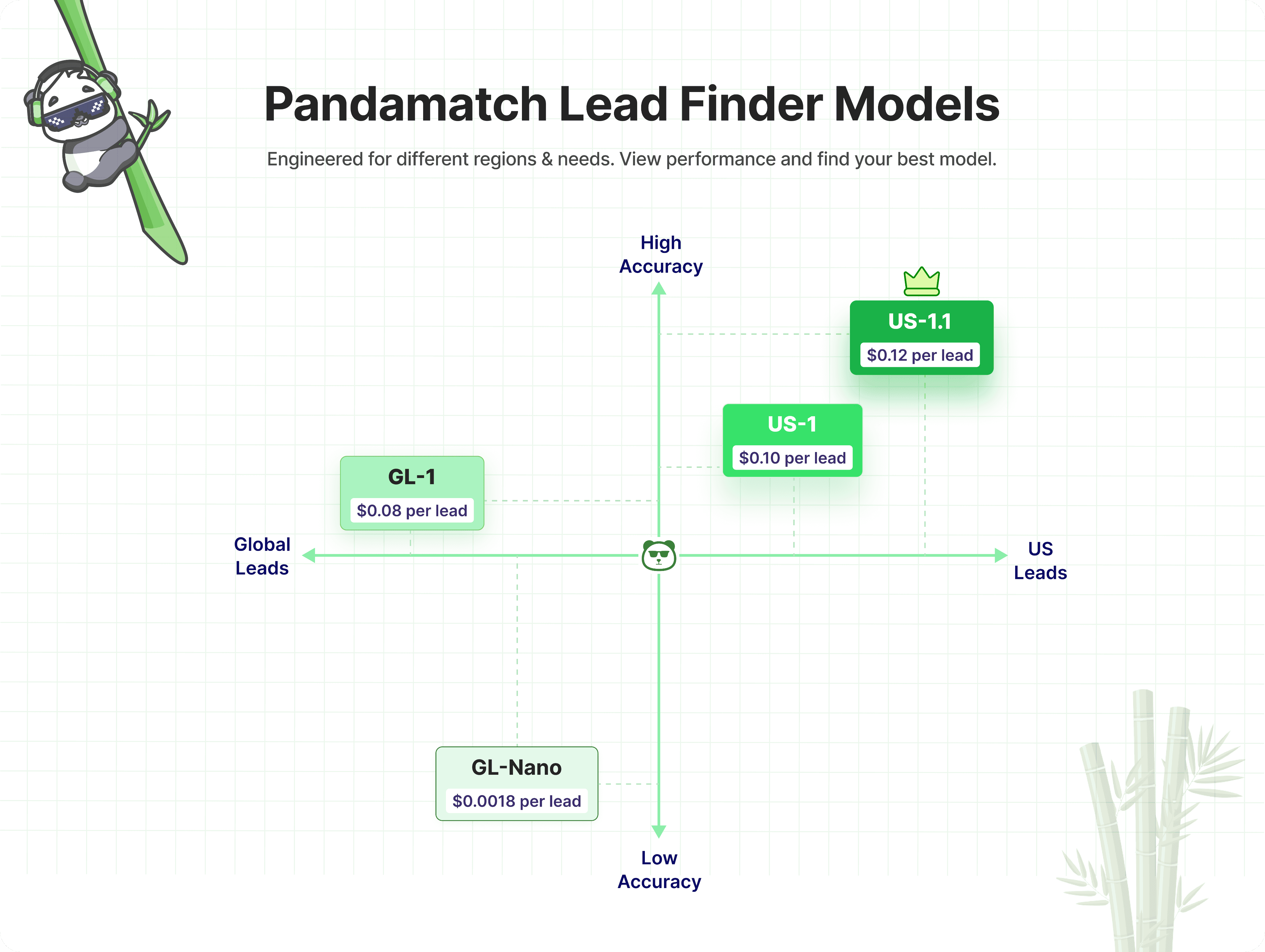
Explaining the difference between the "US 1.1" and "Global" models (accuracy, cost, and geography) in a way that helped users make instant purchasing decisions.
Establishing Authority :
Creating "Expert Content" that helped our niche audience of salespeople improve their cold-outreach success, thereby positioning PandaMatch as a thought leader.
Sensitive User Transition :
Designing the communication for a platform-wide shift (transfer to another platform). The challenge was to frame a potentially disruptive change as a "Premium Upgrade" to avoid user churn or negative sentiment.
Technical Compliance :
The backend required a very specific file format (One domain per row, max 10k). Communicating these "rules" without sounding restrictive was a major UX challenge.
Design Solutions
I moved away from text-heavy pricing tables. I implemented a Chromatic Hierarchy to represent model strength:
Low Accuracy / Global: Used light, muted tones to signal entry-level utility.
High Accuracy / US 1.1: Utilized our vibrant brand green (signaling "Go" and "Success") to highlight the premium model.
This visual "shorthand" allowed users to understand the ROI of each model without reading a manual.
Strategic Brand Leveraging :
To support our community-led growth, I designed a series of informative assets. One key asset focused on Email Deliverability, providing a visual guide on "Emails per Inbox per Day."
By using clean layouts and actionable data, we turned the PandaMatch social channels into a resource for professional sales strategy.
When the decision was made to transfer users to another company, I adopted a "Celebratory UX" approach. Instead of using "Closing" or "Discontinued" language, I designed high-fidelity assets and pop-ups centered around the theme of "Congratulations—You’ve Been Upgraded."
By using premium gradients, celebratory motifs, and reassuring copy, I shifted the user's mental calculation from "loss" to "gain," significantly calming the user base during the transition.
Results & Impact
Visual Anchoring :
Learned that color gradients are faster than text for communicating "Good/Better/Best" hierarchies.
Design as a Softener :
This project taught me the power of "Design Psychology" in business—how the right colors and framing can turn a difficult business transition into a positive user milestone.
Community Trust :
By providing free, high-value information (like email frequency guides), we created a loyal user base that followed the brand through its evolution.
The Full-Stack Designer :
Validated my role not just as a "UI builder," but as a strategic communicator who handles the product's narrative across all touchpoints.


